Why unit normalisation decides whether the analysis is real
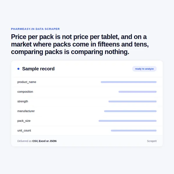
The first chart anybody builds from pharmacy data compares product prices and shows a scatter that means nothing, because a strip of ten and a bottle of sixty are on the same axis.
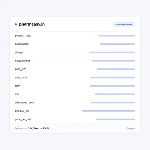
Unit normalisation fixes it and has to happen at collection time, when the pack size and the form are on the same row as the price. Retrofitting it later from a price column and a product name is guesswork, and it is guesswork about medicines.
The second reason is the substitute graph. Indian pharmacy competition happens largely between brands of the same molecule, and the platform publishes those relationships directly. Collected as rows, they show which brands compete, how wide the price gap is between the branded original and its alternatives, and how that gap moves - which is the analysis a pharmaceutical company operating in this market actually wants.
The third is the discount, which is close to permanent. The maximum retail price is a regulated ceiling rather than a selling price, and treating it as what people pay produces a market picture nobody would recognise. Both numbers, on the same row, with a timestamp.
The fourth is scope honesty: this is one platform, not the Indian pharmaceutical market. Offline retail dominates and prices differ. A dataset from here is online pharmacy pricing, and we describe it that way.